WorkOnePulse
OnePulse
A real-time consumer research product had outgrown its own interface: survey creation was slow, web and mobile had drifted apart, and every new feature cost more than the last to ship consistently.
- Timeframe
- February 2022 — March 2023
- Role
- Senior UI/UX Designer
- Scope
- Design Systems, Product Design, Web & Mobile
Two products, one system.
Researchers build and read surveys on the web; respondents answer them on a phone. Both were drifting apart with every release, so the work started by making them one documented system rather than two codebases that happened to share a logo.
Three questions, not thirty.
Onboarding states the whole contract up front — share your opinion in three questions, on things that interest you. A survey app lives or dies on the first one a person is asked, so that screen carries the promise rather than a feature tour.
A feed, because a queue of chores is not one.
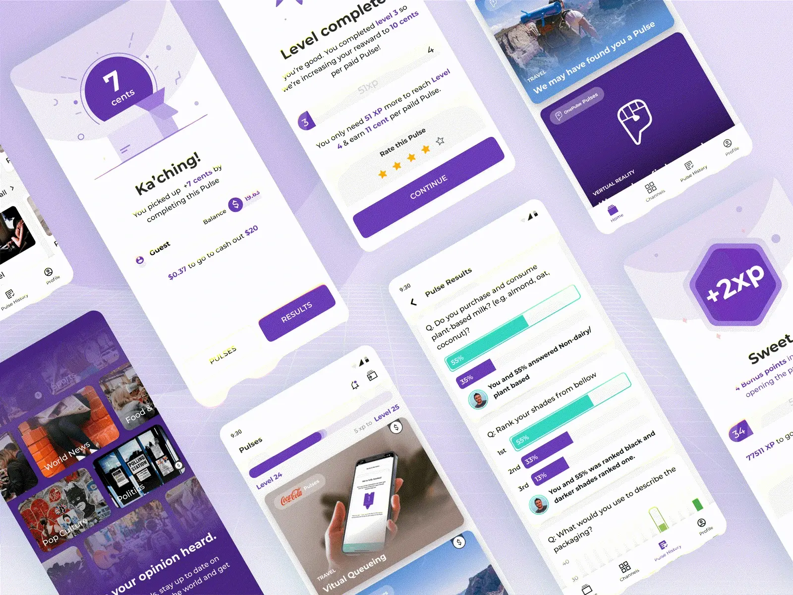
Available pulses arrive as a scrollable feed with the subject shown before the ask. Respondents choose what to answer, which costs some completions on any single survey and buys back the willingness to open the app tomorrow.
Interest first, survey second.
Channels group pulses by what someone actually cares about — entertainment, sport, food — so the panel self-sorts by interest instead of being sliced by demographic alone. Better matching is what lifted completion, not shorter surveys.