WorkSynchromedics
Synchromedics
Medical organisations were tracking workplace injuries, employee health records and clinic communication across separate systems, with compliance obligations sitting on top of all three.
- Timeframe
- 2021 — 2022
- Role
- UI/UX Designer, contract
- Scope
- Product Design, Web Application
The day, before it starts.
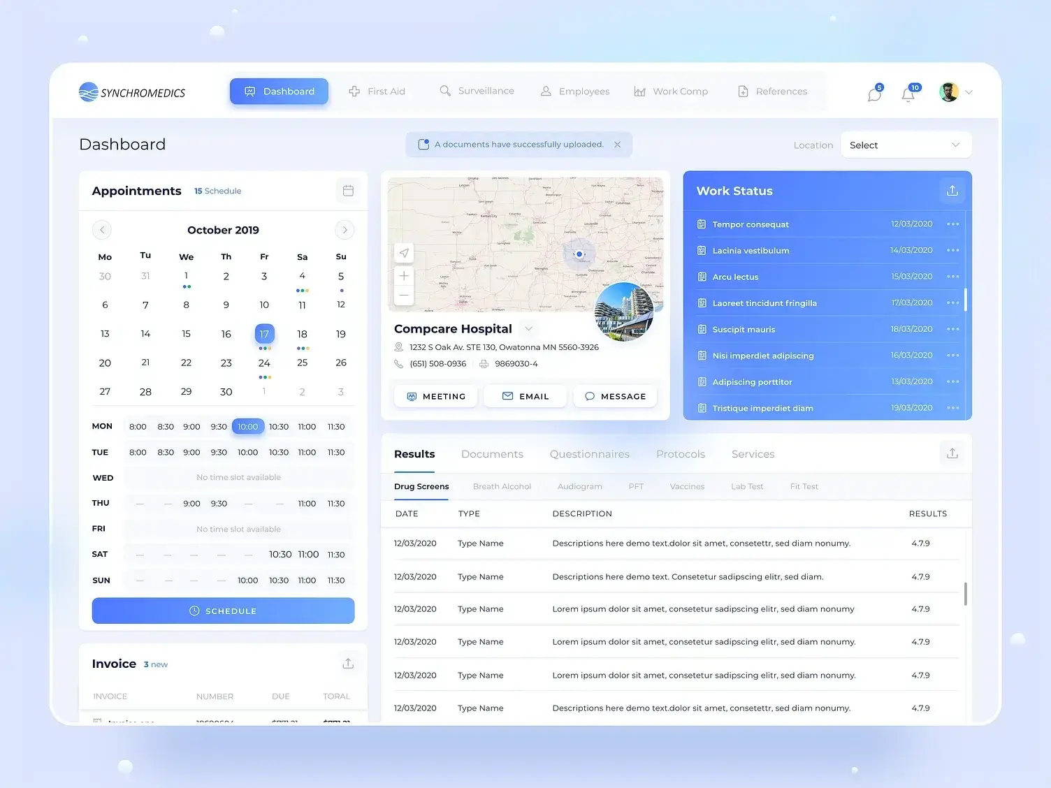
Appointments, the clinic they are at, the work-status queue waiting on a decision, and test results in one screen. Occupational health runs on whether the right person is cleared to work today, so that answer is the first thing on it.
Surveillance data that reads like a chart, not a spreadsheet.
Audiograms, pulmonary and fit testing, labs and vaccines share one shape: a person, a date, and thresholds that shift colour as they cross the limits that matter. Reading a hearing test should not require remembering which decibel level is the concerning one.
A claim, mapped to the body and the place it happened.
Workers' compensation opens on a body diagram with the injury marked, claim counts split by recordable and lost-time, and the cases plotted where they occurred. Compliance reporting needs those cuts anyway — better to make them the interface than a quarterly export.
First aid, and the line where it stops being first aid.
Every case is logged against the one number that decides the cost: how many became workers' compensation claims. Training status and certification expiry sit in the same view, because the answer to a rising conversion rate is usually one of those two.