WorkDataRovers
DataRovers
Healthcare billing teams could see what they had been paid, but not why the rest had been denied. The answer existed — spread across claim files, payer rules and adjustment codes — and getting to it meant an analyst, a spreadsheet, and a week.
- Timeframe
- 2023
- Role
- Freelance Product Designer
- Scope
- Product Design, Design Systems, Web Application
Four numbers, then the reason behind them.
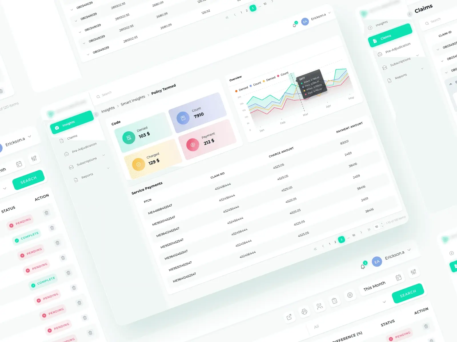
Insights opens on claims count, paid, write-offs and patients — and then keeps going, into billed-versus-paid by year, dollar amounts by payer, and code utilisation. The summary tiles are a way into the charts, not a substitute for them, so nobody makes a call on a headline figure alone.
Every claim carries its own status.
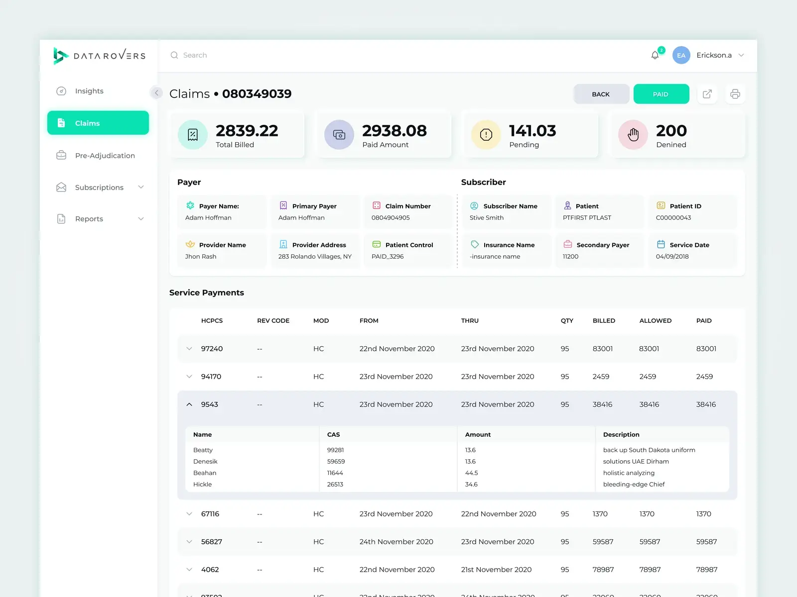
The claims list is a working queue, not a report — claim ID, billed total, payment, patient responsibility, the percentage difference, and whether it is still pending. Difference sits next to status on purpose: the gap between billed and paid is the thing being chased, so it is never a click away.
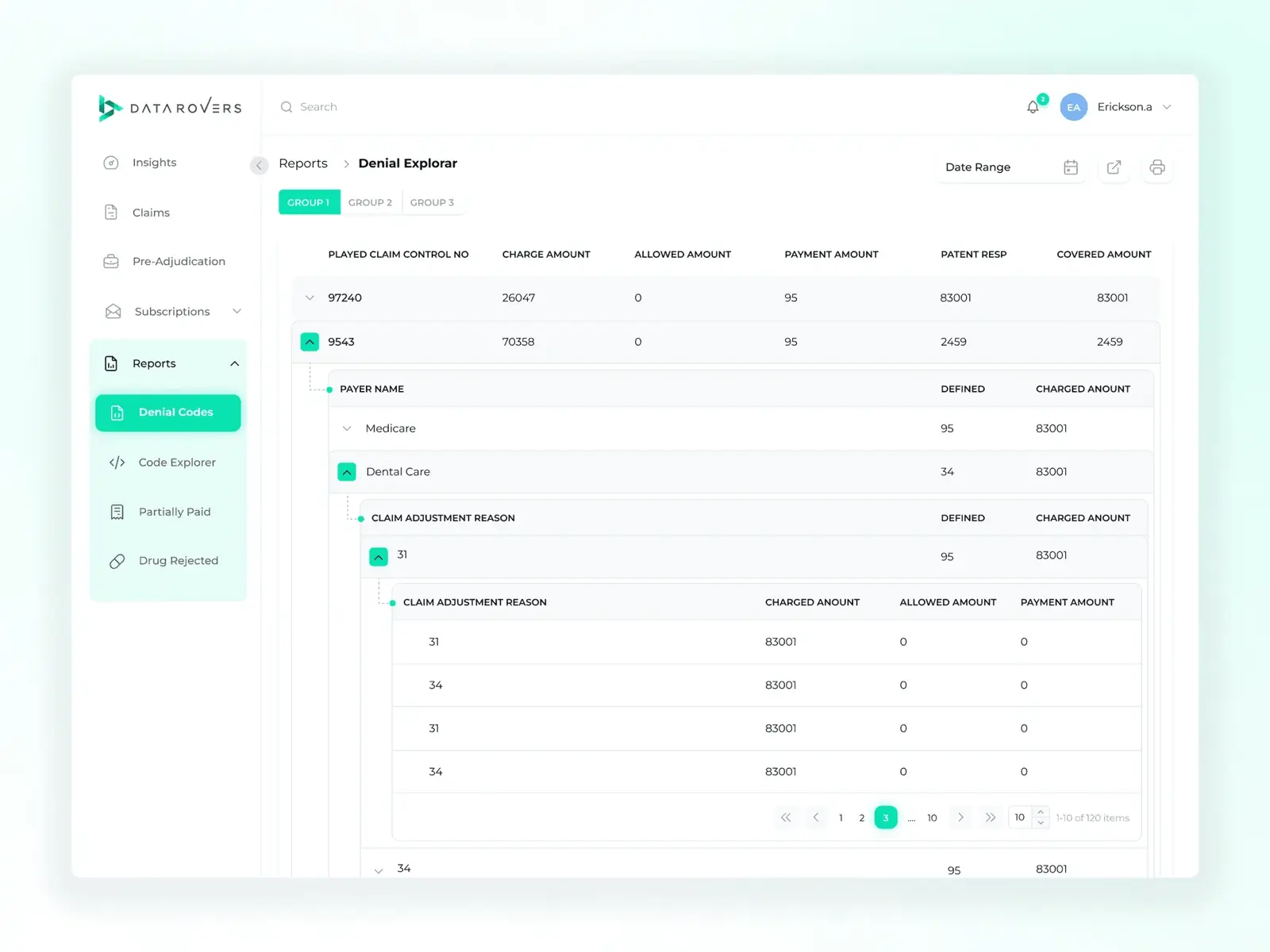
The denial explorer goes down four levels without losing the thread.
A denied claim opens into payer, then adjustment reason, then the individual line items — each level indented under the one above with its own charged, allowed and payment columns. Most analytics tools answer "how much"; the hard part in billing is "which code, from which payer, and how often".
A kit sized for tables, because most screens are one.
An enterprise data product is mostly rows. The system was built around that — density, alignment and truncation rules for tabular data first, then charts, filters and the shell around them. It shipped as a documented UI kit so the team could add screens without redrawing the grammar each time.